Demonstrations#
You can check out the Jupyter notebook demo at the InteractiveDemo
Code used to make the fits and figures in the prospector paper is available in this github repository.
Interactive Figure#
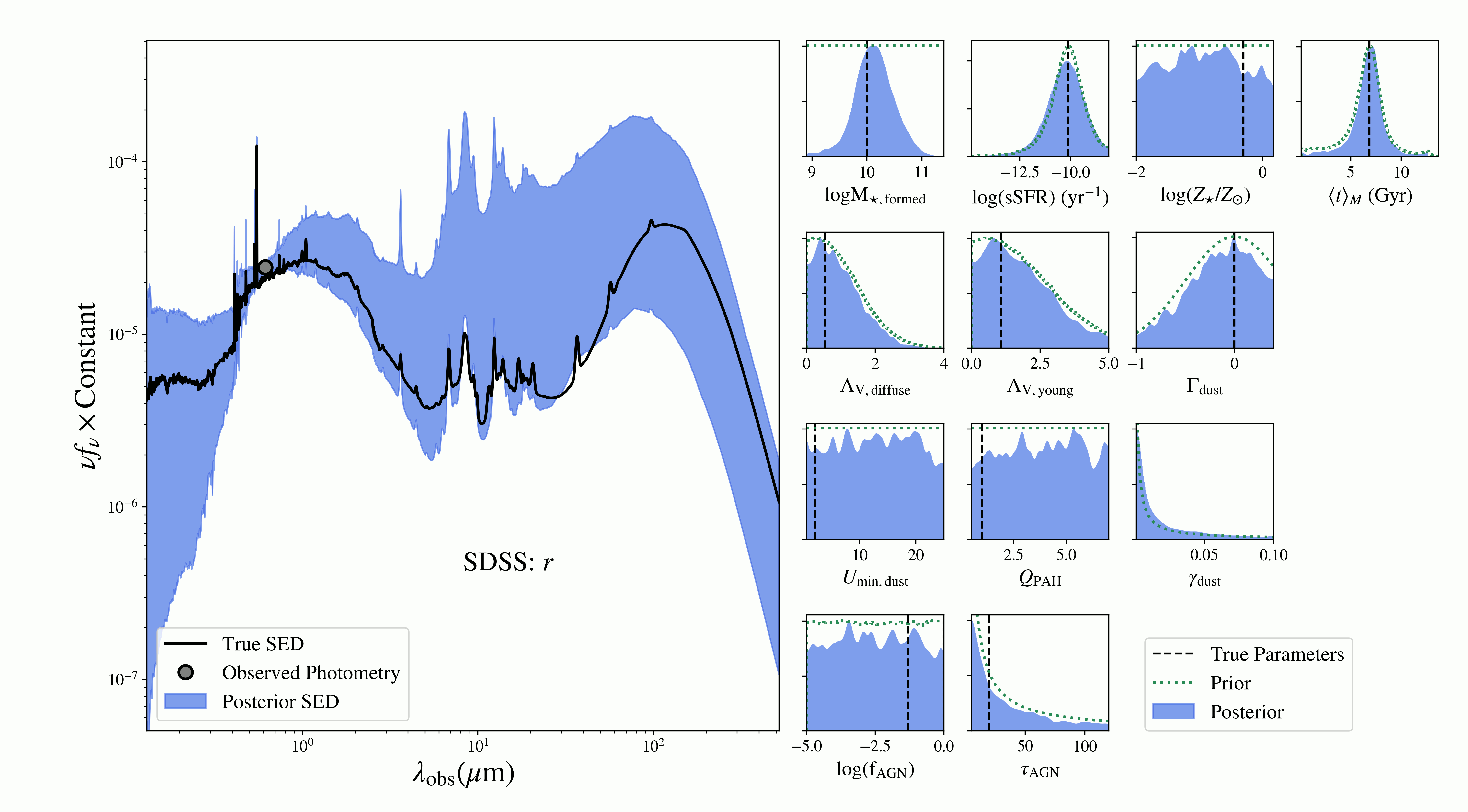
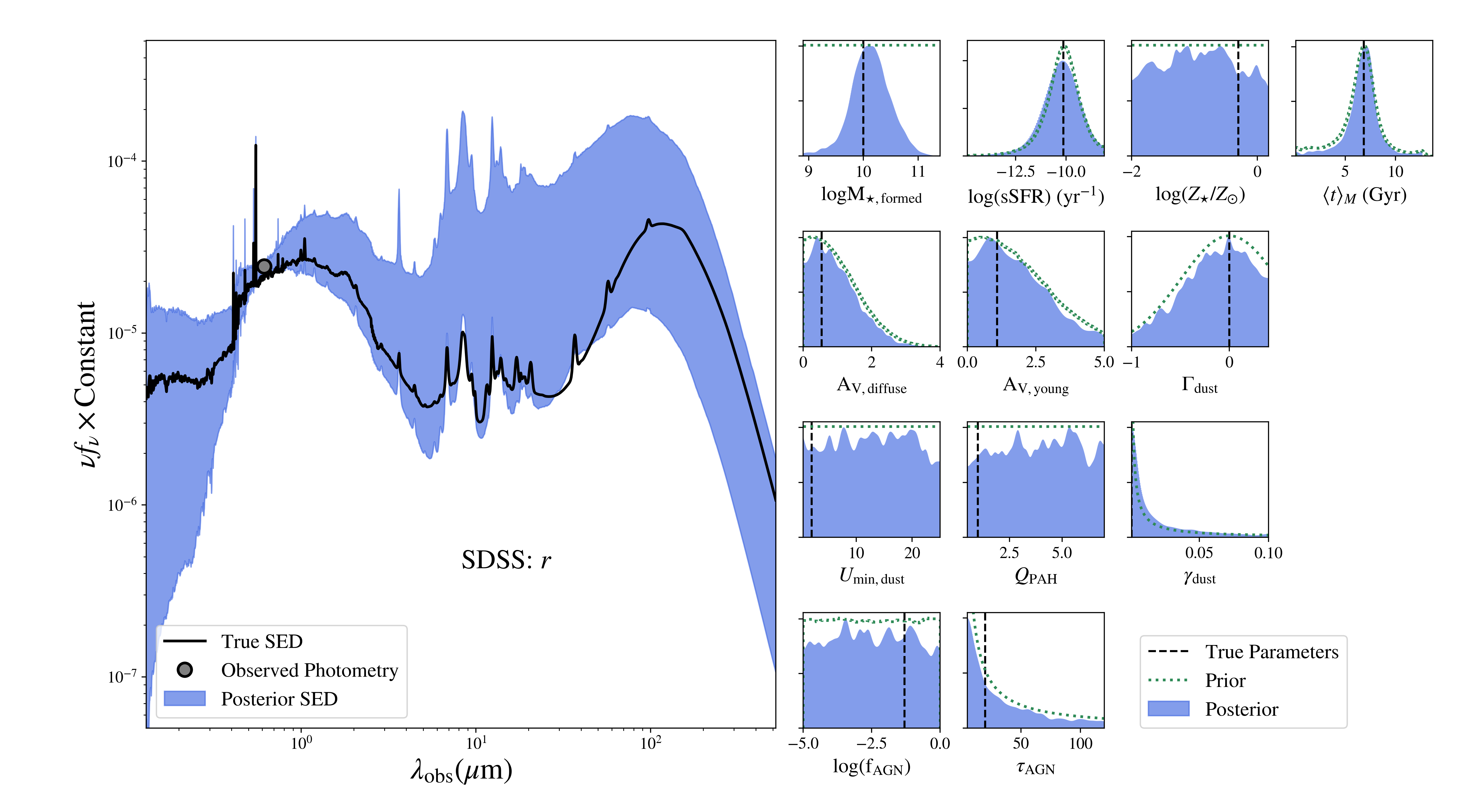
Also, below is an example of inference from an increasing number of photometric bands. Model parameters and SEDs are inferred (in blue) from a changing number of mock photometric bands (grey points). The mock is generated at the parameters and with the SED marked in black. This shows how with a small amount of data most posteriors are determined by the prior (dotted green) but that as the number of bands increases, the data are more infomative and the posterior distributions are narrower than the prior.
Click the buttons show the inference for different filter sets:
→